W
A
T
ean Wood, PhD
ill Mino
fra Panahi, PhD
eodor Anderson
US and Global Health Metrics for Disease and Life Expectancy Predictions
S
A machine learning project by:
Probing the Links Between Energy Sources, Pollution, and Socioeconomic Factors with Various Health Metrics
W
A
T
S
The
Project :
Introduction

Introduction
People are generally afraid of nuclear power because of the health concerns with radiation. But should they be?
Does proximity to a power plant matter?
Introduction
Introduction

Can a country's life expectancy be predicted with other factors?
-
Features:
- County geographic locations
- Nuclear power plant locations and capacities
- Fossil fuel power plant locations, capacities, and pollutant emissions
-
Targets:
-
Cancer incidence (from 2015 to 2019 from CDC and NIH)
-
Cardiovascular disease incidence (from 2017 to 2019 from CDC)
-
Respiratory disease incidence (from American Lung Association)
-
US Data Used
-
Features:
- GDP per capita
- CO, NO, NO2, SO2 levels
- Healthcare spending per capita
- Poverty rates
- BMI
-
Target:
-
Life expectancy
-
Global Data Used

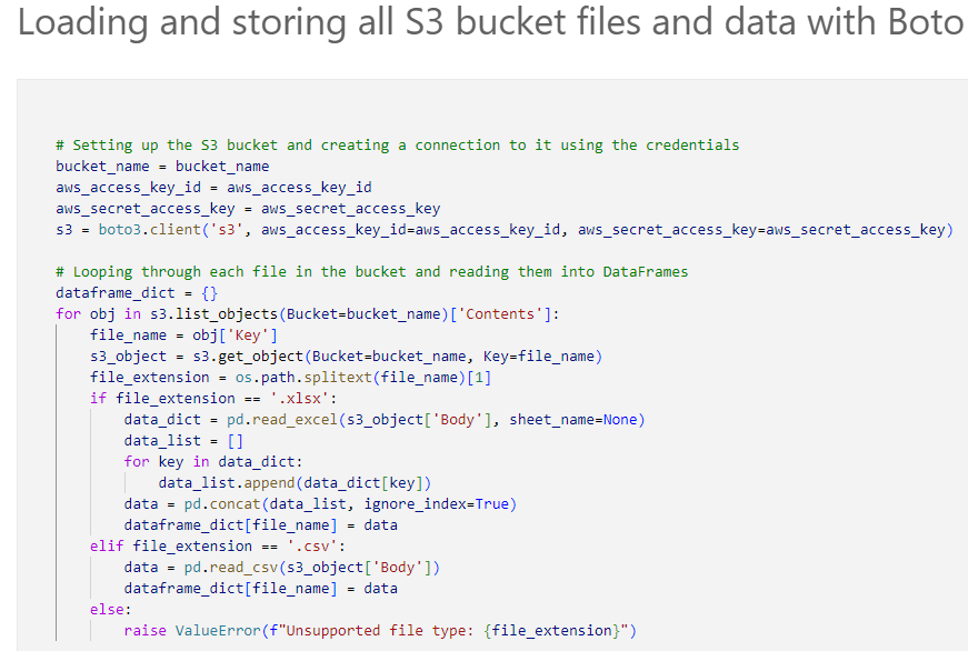
Step 1: Raw Data uploaded to S3 Bucket
ETL
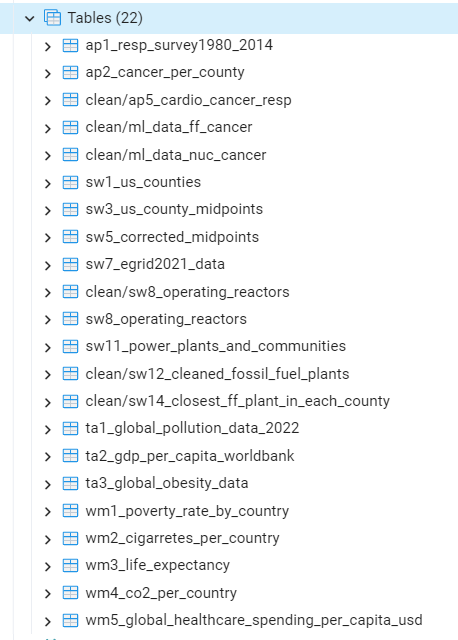
Data Cleaning and ETL

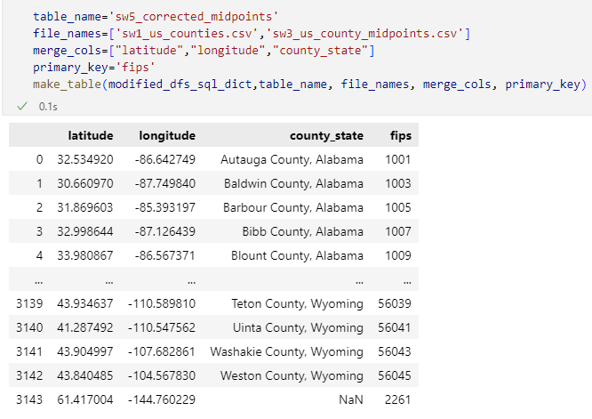

Function to join tables
Modules used :
Boto3, to connect to S3 and store data in Python
Pandas, to transform data in Python
Haversine, to calculate distances between center coordinates of counties and coordinates of powerplants
SQLAlchemy, to make SQL joins, write table making schemas, and connect to PgAdmin database
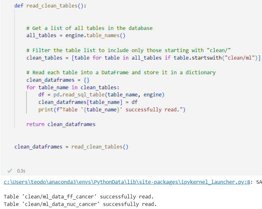
Step 2: Cleaned and joined with Python
ETL

ETL
Step 3: Load with clean data SQL Alchemy from pgAdmin
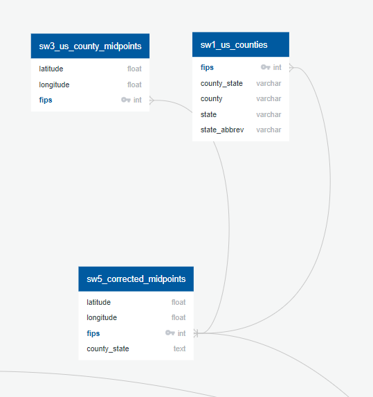
ERD US 1
Joining a GeoJSON file with county coordinates, and Us counties file to find exact midpoints for US counties and their names
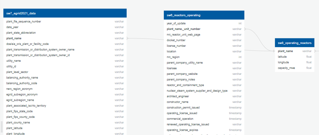
ERD US 2
From an EGRID dataset, and a file of currently operating plants with operating reactors, Mwe output, and coordinates
ERD US 3
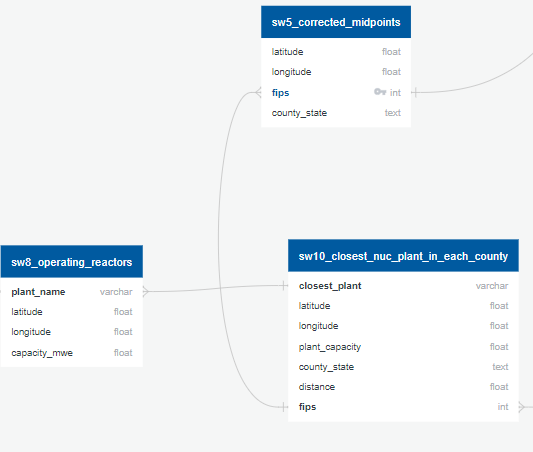
Combine the midpoints table with an EPA data set of fossil fuel plants into a dataset with counties, the distance from a fossil fuel plant, and that plants capacity.
Combine both into a dataset with counties, the distance from a nuclear power plant, and that plants capacity.
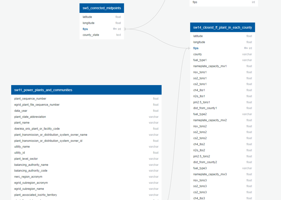
ERD US 4
Afra's datasets, containing
- NIH report on cancers per county
- a dataset from the CDC with by county cardiovascular diseases ,
- respiratory disease report from lung.org
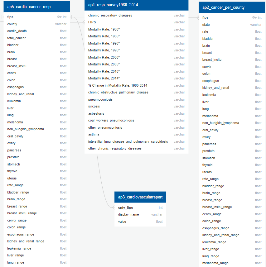
ERD US 5
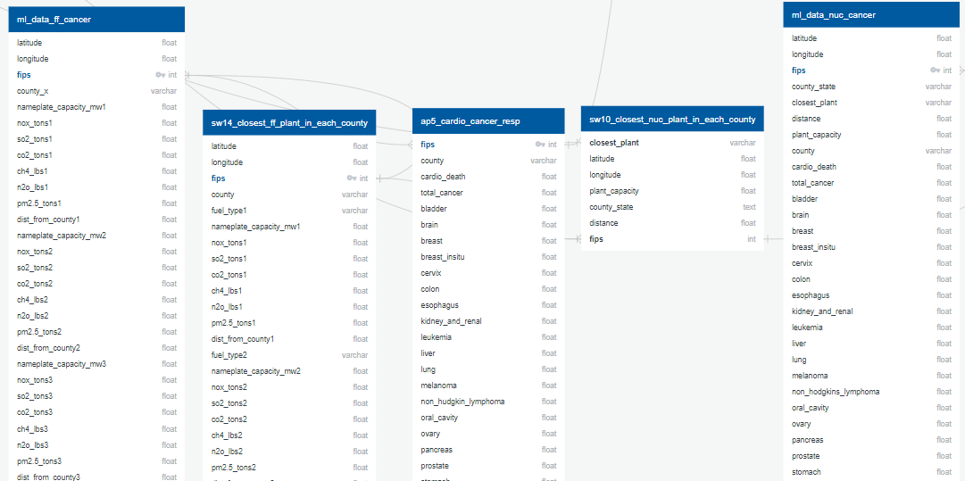
- Afra's cardio_cancer_resp file was joined to each set of plant data (nuclear and fossil fuel)
- For the fossil fuel data, the plant type was separated into new dummy variables. Disease incidence per 100k people was calculated for the non-cancer diseases.
- The capacity of each county's closest nuclear plant was divided by the distance to the closest nuclear plant, squared.
- Fossil fuel plant pollutants were normalized by the plant's capacity.
- These were the final prepped data for US ML models.
ERD Global
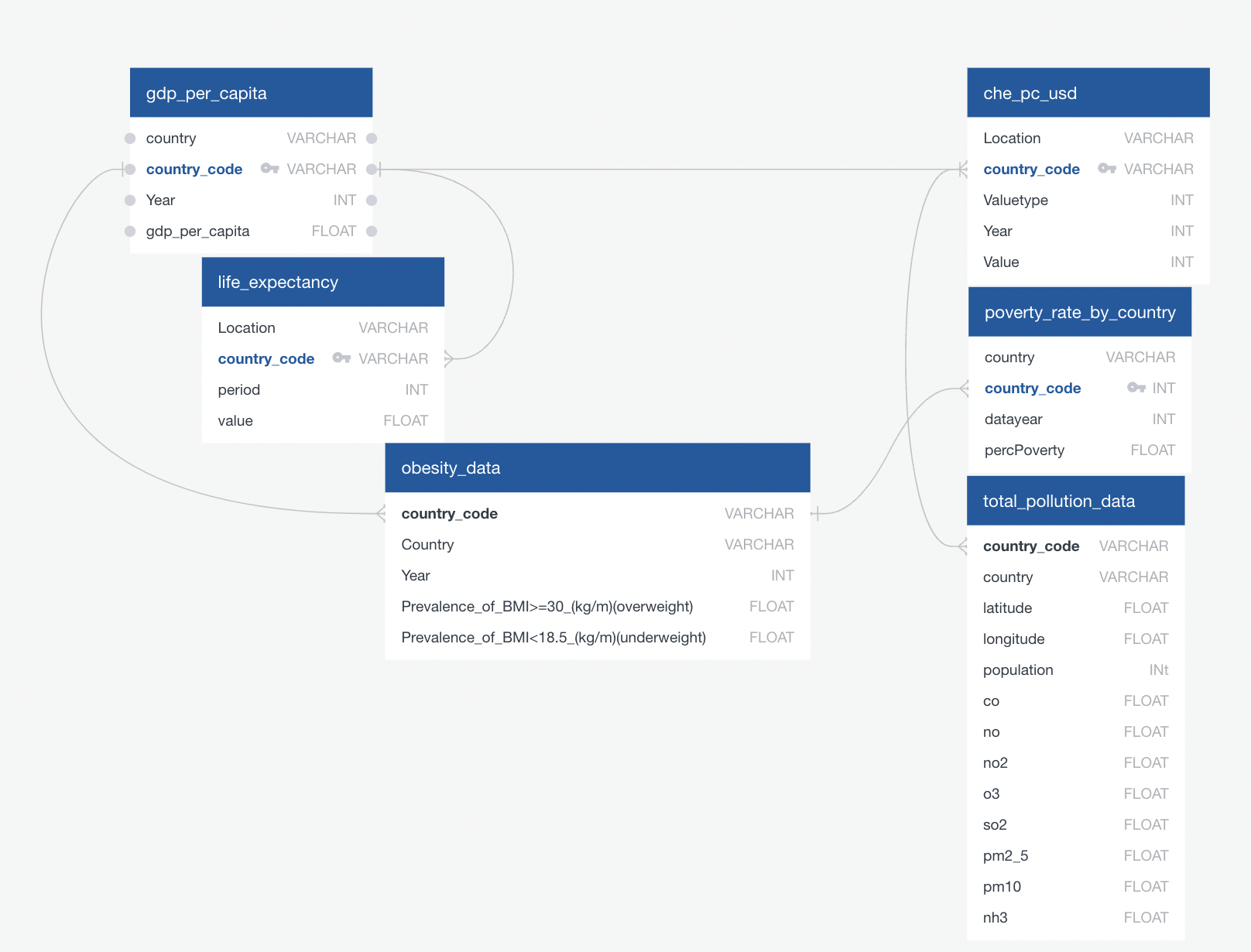
- Tables were joined on Iso-3166 two-letter country code
- Country names normalized to standard US spelling
Initial plots to look for any potential correlations:
- Map of US with power plant locations and disease rates
- Bar chart correlating disease rates to distance
- Scatter plot showing disease rates as function of various pollution metrics
US Data Exploration
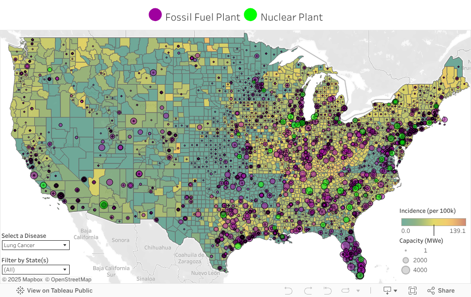
Power Plants vs. Diseases
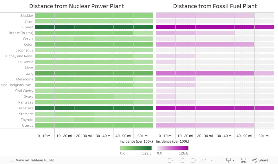
Cancer Rates vs. Distance

Disease vs. Pollution Metrics
- Linear regression
- Lasso (Least Absolute Shrinkage and Selection Operator) Linear regression:
- Modification of linear regression which minimizes the complexity of the model.
- Random forest regression
- Ensemble of desicion trees, prone to overfitting
- Random forest regression with XGboost (eXtreme Gradient Boosting)
- Minimizing the loss function by adding weak learners using a gradient descent optimization algorithm.
- In each iteration, should reduce the loss function
US ML Model - Introduction

US ML Model - Feature correlation
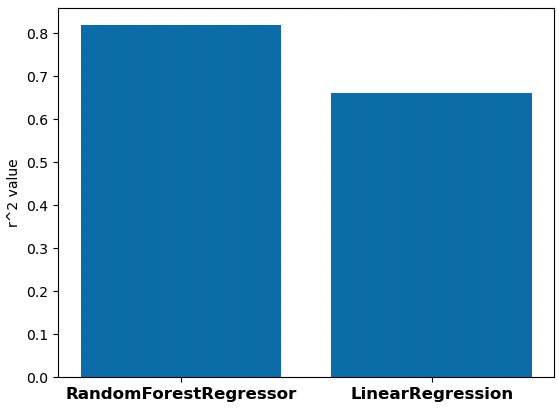
US ML Model - Comparing models
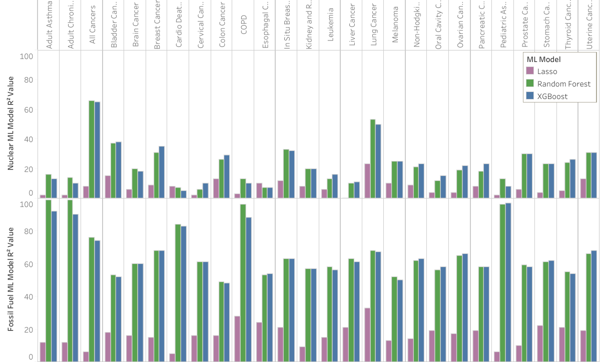

US ML Model - Feature importance
Pollution related features are important in predicting some cancer rates
-
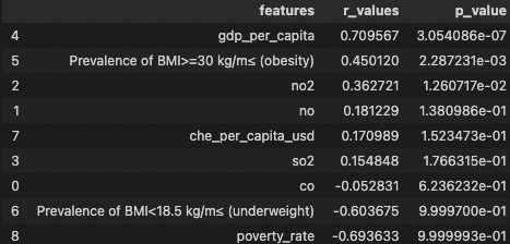
Correlations between feature data and life expectancy
-
Visualizations:
- Map of life expectancy
- Scatter plot showing life expectancy as a function of socioeconomic factors
Global Data Exploration
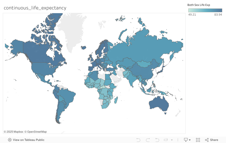
Continuous Life Expectancy Map
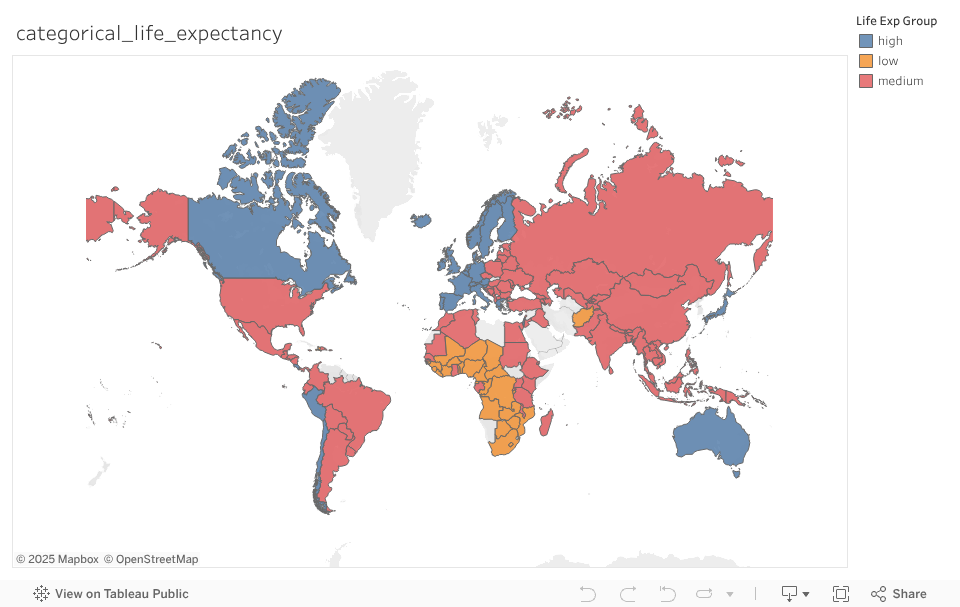
Categorical Life Expectancy Map
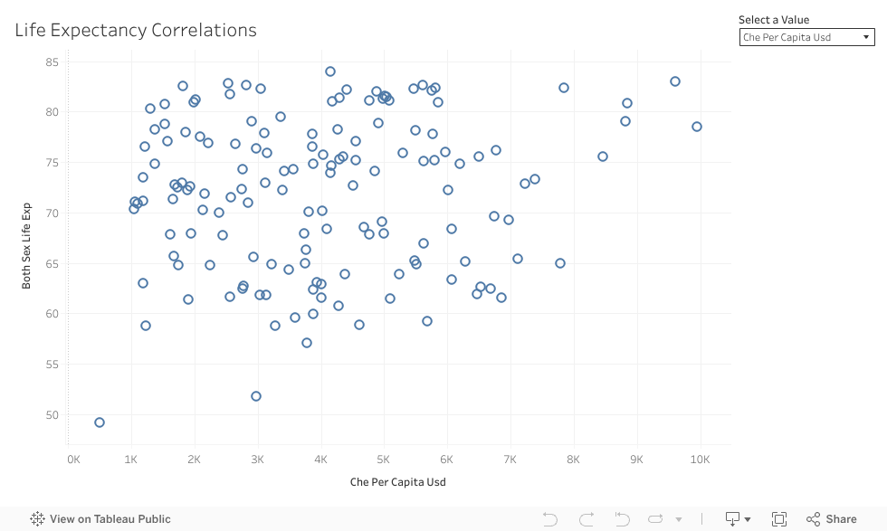
Feature Data Correlations
- ML Models: Scikitlearn
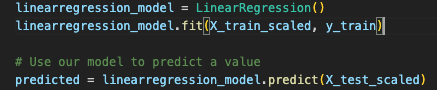
- LinearRegression
- RandomForestRegressor
- LogisticRegression
Global ML Model - Data Analysis

Global ML Model - LinearRegression
- Multiple Linear Regression: determine feature-target correlations
Global ML Model - RandomForestRegressor
- Predict continuous life expectancy values
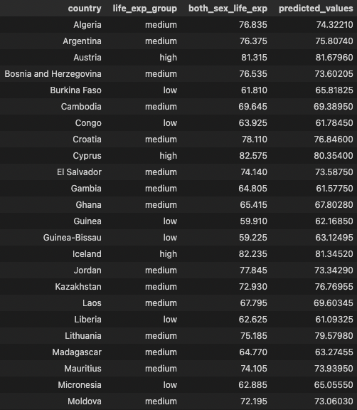
| Training Data | Testing Data |
|---|---|
| 0.97 | 0.82 |
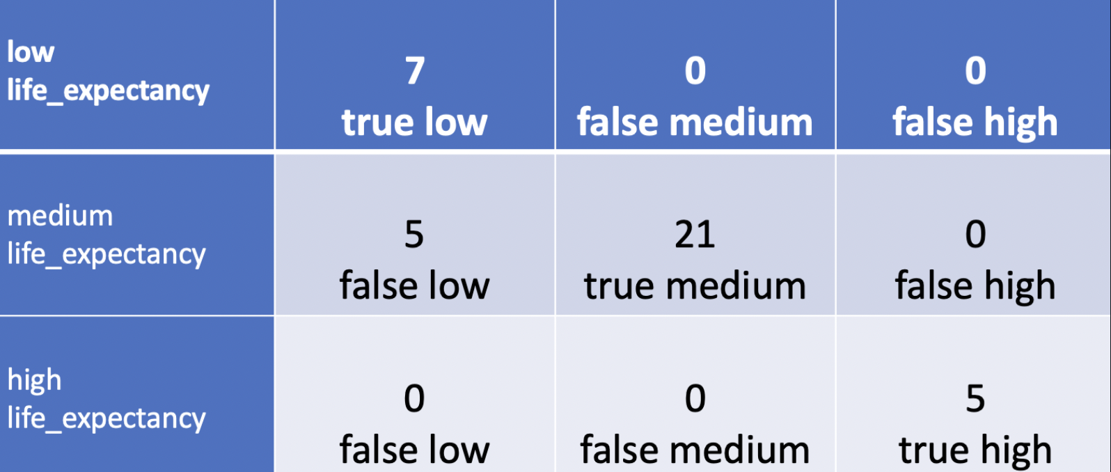
Global ML Model - LogisticRegression
- Predict categorical life expectancy values
- high life exp >= Mean + 1SD
- medium between +/- 1SD
- low life exp <= Mean - 1SD
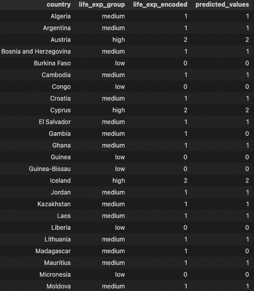
| Training Data | Testing Data | Accuracy Score |
|---|---|---|
| 0.82 | 0.87 | 0.94 |
Conclusion
- US county proximity to fossil fuel power plants correlates with higher cancer, cardiovascular, and lung disease incidences. No correlation with nuclear plants.
- Country GDP per capita correlates with higher life expectancy.
Future Work
- Better layout and website for consuming visuals
- A more robust ETL Python script to automatically clean data and group by year, continent/country development cluster, and larger datasets with more features and year by year records.
- Linear regression input tables
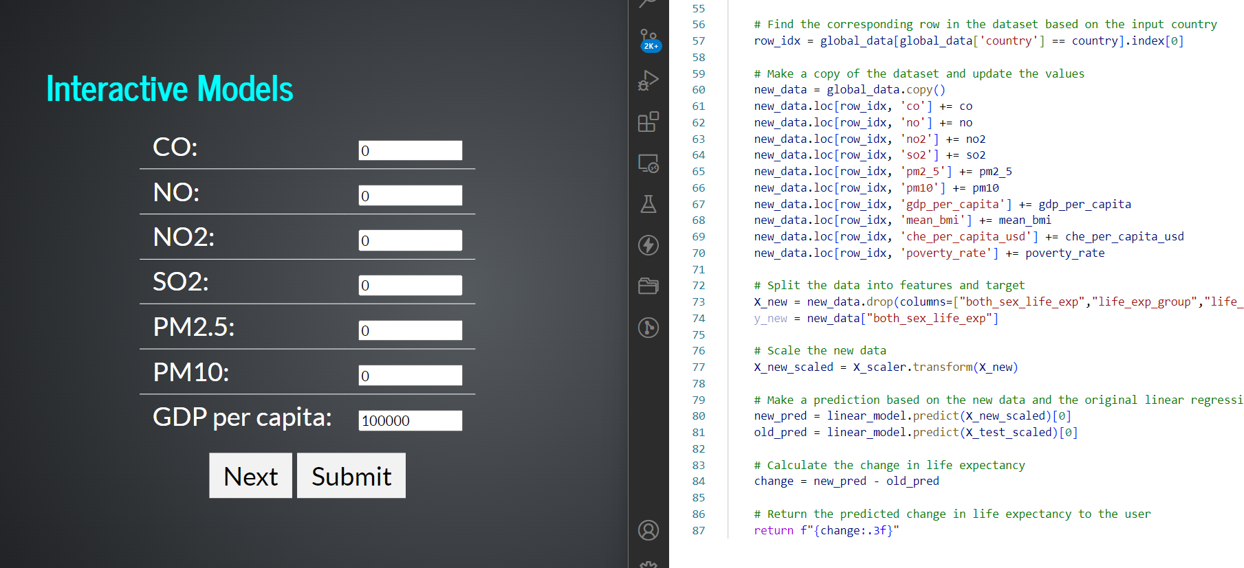
- Interaction to play around with Neural Networks, different factors to predict, different models, etc
Future Work